
# SEO(검색 엔진 최소화,Search Engine Optimization) ; 구글이나 네이버 등에 자신의 웹사이트/페이지를 노출할 수 있도록 정보를 최적화하는 작업
설정 사항
글씨 ; color, font-size, font-weight, font-family, line-height
상자 크기 관련 ; width, height, padding, box-sizing, overflow(hidden), flex-grow
상자 꾸미기 관련 ; border, border-radius, box-shadow, text-align, transition, transform(rotateY), opacity
버튼 ; cursor, transition / :hover
위치 관련 ; position:absolute, top/bottom/right/left:0, margin:auto, display(flex), flex-wrap(wrap)
배경 ; background-color/image/position(center)/attachment(fixed)/size(cover)
함수 ; calc()
기본 설정
img{ display : block; }
a{ text-decoration : none; }
inner{
	width:1100px;			//웹페이지의 주 내용들을 이 안에 적겠음
	margin 0 auto; 			//수평 가운데 정렬하겠음
    position:relative }		//inner내의 요소들을 position:absolute로 함으로써 요소들의 기준점이 되겠음

body{
	color:#333;
    font-size:16px;
    font-weight:400;
    line-height:1.4;
    font-family:'Nanum Gothic',sans-serif;
}
.btn {						// 웹 페이지 내 모든 버튼 동일화시킬 수 있음
    width: 130px;
    padding: 10px;
    border: 2px solid #333;
    border-radius: 4px;
    color: #333;
    font-size: 16px;
    font-weight: 700;
    text-align: center;
    cursor: pointer;
    box-sizing: border-box;
    display: block;
    transition: .4s;
}
.btn:hover {
  background-color: #333;
  color: #FFF;
}
.btn.btn--reverse {			// 동일선택자로 다른 종류의 버튼 설정
  background-color: #333;
  color: #fff;
}
.btn.btn--reverse:hover {
  background-color: transparent;
  color: #333;
}
화면 크기를 줄여도 잘리지 않게 설정
{
    max-width:700px;
 /* width가 아닌 max-width로 설정하면, 창의 크기가 700보다 작아지면 width도 700보다 작아짐.
    width로 설정한다면 창의 크기가 700보다 작아져도 .heroes의 크기는 700크기를 유지하기에 일부잘림 */
}
수직적 가운데정렬
.inner{
	position:relative; 	//자식요소의 위치 기준점
}
.inner .logo{
	position:absolute;	//position:relative인 상위요소를 기준으로 배치
    top:0;
    bottom:0;
    margin:auto 0;		//top:0,bottom:0을 기준점으로 동일하게 떨어짐, 즉 가운데 위치
    width:200px;
    height:200px;
}# 가로너비가 필히 있어야함
수평적 가운데 정렬(확대해도 가운데에 위치)
  {
      left: 50%;						// 왼쪽으로부터 50% 보냄
      margin-left: calc((1100)/-2);		// 다시 왼쪽으로 전체 가로너비의 50% 보냄
}
중간중간에 선 설정
li{
	position:relative; 	//자식요소인 li::before의 기준점
}
li::before{
	content:""; 		//content는 필수 설정해야함
    width:1px;
    height:12px;
    background-color:원하는 색상;
    position:absolute; 	//부모요소를 기준으로 가운데 정렬하기
    top:0;
    bottom:0;
    margin:auto;
}
li:first-child::before{
	display:none;		//사이사이에 선 놓은것이므로 첫번째 요소의 앞은 안보이게
}
왼쪽/오른쪽 배경 채우기
HTML요소
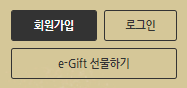
<section class="rewards">
    <div class="bg-left"></div>
    <div class="bg-right"></div>
    <div class="inner">
      <div class="btn-group">
        <div class="btn btn--reverse sign-up">회원가입</div>
        <div class="btn sign-in">로그인</div>
        <div class="btn gift">e-Gift 선물하기</div>
      </div>
    </div>
</section>rewards > .bg-left , .bg-right , .inner를 형제 태그로 둠
CSS요소
.rewards .bg-left{
  width: 50%;
  height: 100%;
  background-color: #272727;
  position: absolute;
  top: 0;
  left: 0;
}
.rewards .bg-right{
  width: 50%;
  height: 100%;
  background-color: #d5c798;
  position: absolute;
  top: 0;
  right: 0;
}
.rewards .inner{
  background-image: url("../images/rewards.jpg");
  height: 241px;
}.bg-left , .bg-right는 width:50%, height:50%, position:absolute, top:0, left/right:0으로 왼쪽 오른쪽에 50%씩 먹게함 + 배경색 설정
위와 같은 박스 요소 만들기
.rewards .inner .btn-group{
  width: 250px;
  display: flex;
  flex-wrap:wrap;
}
.rewards .inner .btn-group .btn.sign-up{
  margin-right: 10px;
  width:130px;
}
.rewards .inner .btn-group .btn.sign-in{
  width: 110px;
}
.rewards .inner .btn-group .btn.gift{
  flex-grow: 1;
  margin-top: 10px;
}.sign-up은 130px, sign-in은 110px, 그 둘 사이의 margin은 10px 총 250px
display:flex이므로 기본값인 가로정렬인데, flex-wrap:wrap이므로, 넘치면 줄을 넘김 -> .gift는 다음 줄로 넘어감
.gift는 flex-grow이므로, 최대한 자리를 차지하게 됨
배경 영상 깔기
.youtube {
    position: relative;
    height: 700px;
    background-color: #333;
    overflow: hidden;
}

.youtube .youtube__area {
    width: 1920px;
    position: absolute;
    left: 50%;
    margin-left: calc(1920px/-2);
    top: 50%;
    margin-top: calc(1920px * 9 / 16 / -2);
}
'WebProgramming > CSS' 카테고리의 다른 글
| [SCSS] SCSS란 ? / SCSS 문법 (0) | 2022.06.13 |
|---|---|
| [CSS] 전환(transition), 변환(transform)-2차원,3차원 (0) | 2022.05.25 |
| [CSS] 배치(position), Flex 박스(flex) + @ (0) | 2022.05.25 |
| [CSS] 글꼴, 문자, 배경 속성(font, text, background) (0) | 2022.05.25 |
| [CSS] 너비 (width,height,margin,padding,border) + 단위, 색상 (0) | 2022.05.25 |
| CSS 의사 클래스(:link,:hover,:checked,:first-child) (0) | 2022.05.06 |
| CSS 기본 문법(선택자) + 팁(주석,CSS적용,선택자 우선순위) (0) | 2022.04.25 |